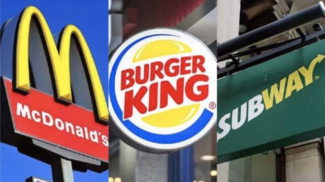
This Is The Real Reason That So Many Fast Food Logos Are Yellow

It's definitely no coincidence...
McDonald's, Burger King, Subway ... Apart from their high-calorie menus, (and, let's face it, the fact that they are all very, VERY tempting after a long day), these three fast-food chains all have something else in common: their logos are all partly yellow.
Discover our latest podcast
This may seem a surprising thing to have in common, but it is no coincidence. If fast food brands use and abuse this colour in their marketing, it is for psychological reasons. As reported by the AFP, '62% to 90% of people make daily decisions based on colour.'
More under this adMore under this adIt turns out that yellow is a colour which is both attractive and relaxing, often associated with a certain sense of comfort. Furthermore, it effectively attracts the eye just like other bright colours such as red, orange or purple, all considered as particularly effective colours in terms of marketing.
Check out the video above for more...